
Using Custom CSS to Match Your Brand
Use custom CSS for the widget, teaser and messages when the visual controls aren't enough. When to use CSS versus the built-in controls, and keeping it responsive.
Use the settings first
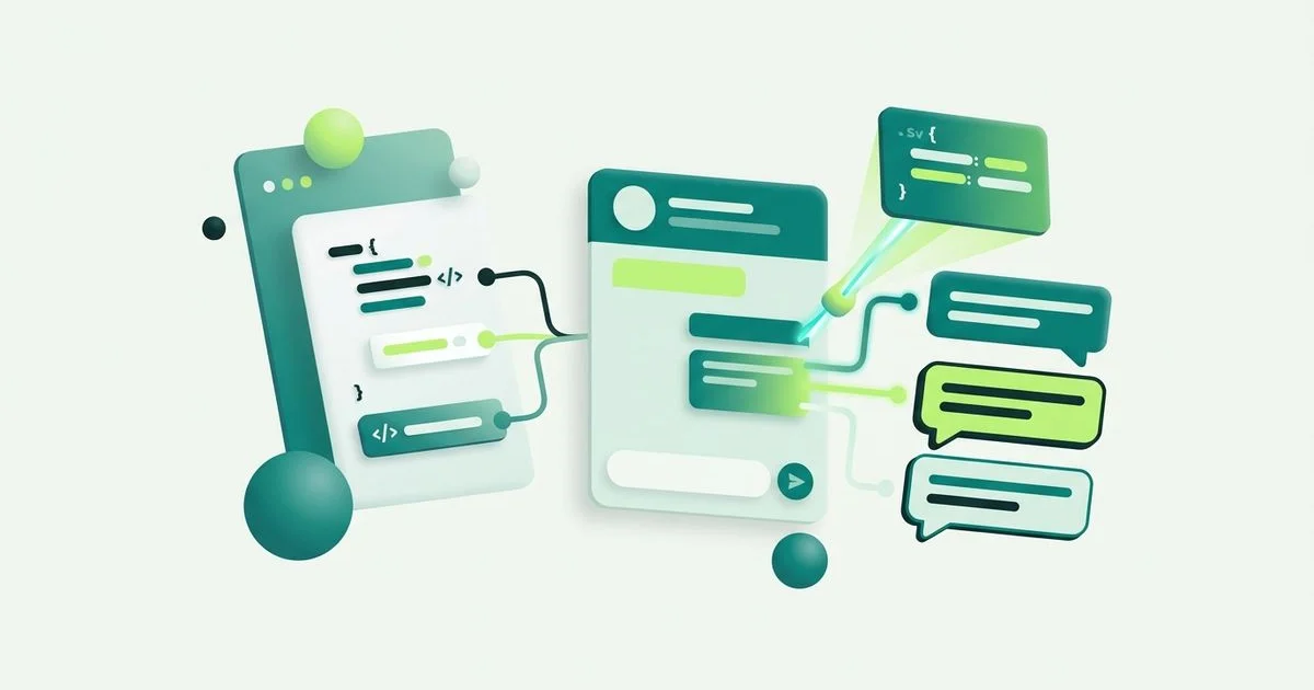
Custom CSS is the finishing tool, not the starting one. Everything the Website Chat & Widget Customization settings already cover should be done there: colours for the widget, header, messages, inputs and controls, font families and sizes, placement and offsets, border radius, padding, borders and shadows.
Two reasons. Settings are less fragile: they are designed against the widget’s structure and stay valid as it evolves. And they are visible to whoever inherits the account, whereas a block of CSS is an artefact someone has to decode later.
So the honest rule: reach for CSS when you have used the controls and something specific still does not match.
What you can style
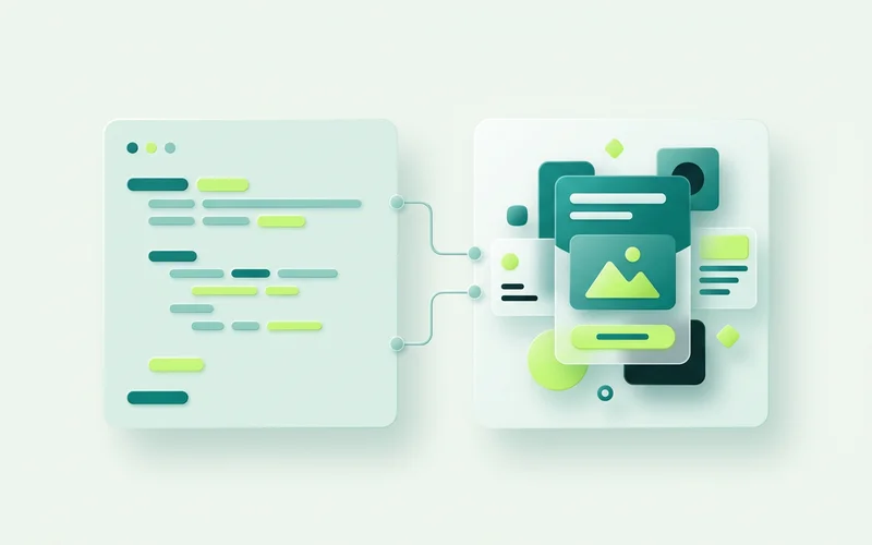
Custom CSS is available for three targets:
The general widget: the container and the panel. Framing, spacing, anything structural the settings do not expose.
The teaser: the closed-state prompt beside the launcher. This is where most custom work goes, because the teaser is the element most visitors see and the one where a brand’s personality shows.
Messages: the conversation bubbles. Line height, bubble shape, the spacing between consecutive messages.
The cases that genuinely need it
A brand font that will not load. If your typeface comes from a font service, the widget may need the family declared explicitly.
Matching a shadow system. Sites with a consistent elevation system often need a specific shadow value rather than an approximation.
Tightening message spacing. If your brand is dense and precise, default chat spacing can feel loose.
An exact teaser treatment. A specific corner radius, a particular padding ratio, an offset that lines the teaser up with something else on the page.
Dark backgrounds. Sites with a dark theme sometimes need adjustments beyond swapping colour values.
Three rules that keep it maintainable
Change as little as possible. Every rule you add is a rule that might conflict with a future update. A short block of intentional overrides ages better than a stylesheet that restyles everything.
Avoid fixed dimensions. Fixed widths and heights are the leading cause of a widget that looks perfect on a laptop and broken on a phone. Prefer relative units and let the widget size itself.
Leave a comment. Two lines explaining why a rule exists will save whoever looks at it next, quite possibly you, a confusing afternoon.
Test at three widths
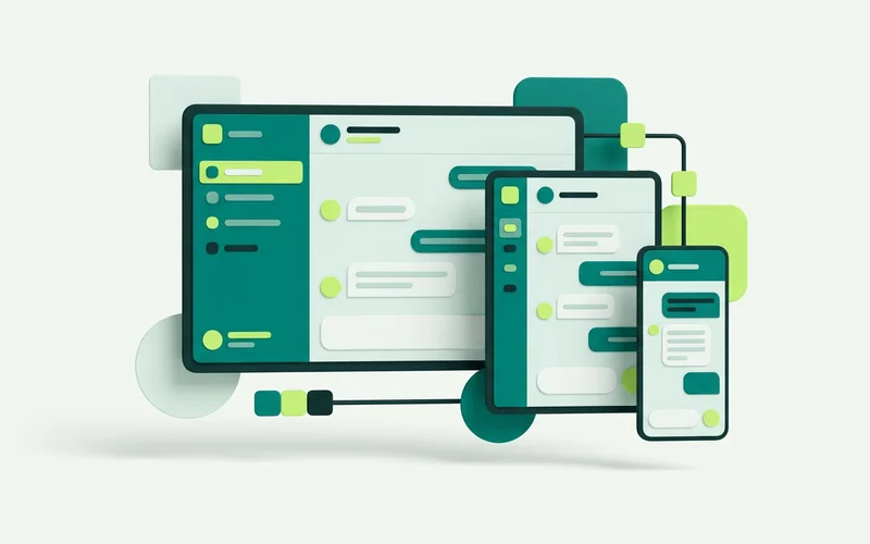
Check a desktop width, a tablet width, and a real phone. The phone matters most and is skipped most often, because a narrow desktop browser window is not the same environment: it has no soft keyboard, no browser chrome eating vertical space, and no thumb.
Open the widget on the phone and type a message. If the input is obscured by the keyboard or the send button drifts off-screen, that is a fixed dimension somewhere in your CSS.
Also test on your longest page and your busiest one. Sticky headers, cookie banners and floating buttons interact with the widget in ways a clean test page never reveals.
When to stop
A widget does not need to be pixel-identical to your site. It needs to look like it belongs there. If you have matched colour, type and framing and it reads as part of the page, that is the goal met, the remaining hours have better uses, like writing the flow that decides what the widget actually says.
A sensible order of work
CSS work on a widget goes wrong when it starts from the details. Work outward instead.
Structure first. Get the panel and teaser sitting correctly at every width before touching anything decorative. A shadow on a mispositioned element is wasted effort.
Then type. Font family, weight and line height on messages and the teaser. This is the change with the largest perceptual effect for the least code.
Then surfaces. Bubble shape, border treatment, spacing between consecutive messages.
Then the small stuff. Shadows, transitions, the exact radius on the launcher.
Stopping after the second stage is a legitimate outcome. Most widgets look right once position and typography match, and the remaining work is diminishing.
Things that commonly break, and why
Fixed heights on the panel. On a phone with the keyboard open, available height shrinks dramatically. A fixed height means the input disappears.
Width in pixels. Fine at 1440px, wrong at 360px. Use relative sizing and let the widget handle its own constraints.
Aggressive overrides on the container. Changing display or positioning on the outermost element tends to break the open and close behaviour, because that behaviour depends on it.
Colour without contrast checking. Brand colours chosen for large headings frequently fail behind 14px message text. Check the pairs you actually use.
Rules written against one state. A widget has closed, open, offline and unread states. Styling only the open state leaves the others looking unfinished.
If something breaks after an update, the fastest diagnostic is to disable your custom CSS entirely and confirm the widget behaves. That tells you immediately whether the problem is yours or ours.
Read next: how to customize your chat widget for the built-in controls, or setting business hours and after-hours behaviour.
Learn more about Website Chat & Widget Customization
An embeddable chat widget you install with a script snippet, then customize to match your site: colours, fonts, placement, hours, and custom CSS.
Questions people ask about this
When should I use custom CSS instead of the built-in controls?
When the visual controls cannot express a specific brand detail, an exact spacing, a particular font weight, a shadow that matches your cards. Use the built-in settings for anything they already cover, since they are less likely to break.
What parts of the widget can I style with CSS?
Custom CSS is available for the general widget, the teaser and the messages. That covers the closed state, the panel and the conversation content.
Will custom CSS break the widget on mobile?
It can, if the rules assume a wide viewport. Avoid fixed pixel widths and large fixed heights, keep font sizes readable, and test on a real phone before you consider the job done.
Related guides
How to Customize Your Chat Widget's Colours, Fonts and Placement
Control your widget's placement and offsets, colours for widget, header, messages and inputs, fonts and sizes, launcher icons and teaser images, and framing.
Read guideSetting Business Hours, Timezone and After-Hours Behaviour
Set business hours and timezone, choose configurable after-hours behaviour, enable offline message intake, and pair it with By-availability flow branching.
Read guideWant to try this on your own site?
No credit card required.